
Typesetting
Understanding how text is displayed
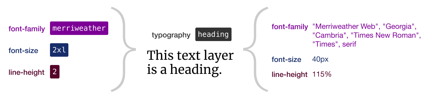
- USWDS does not render text in specific pixel sizes. Instead, it calculates the size of each text element based on these 3 attributes:
- font family: the list of fonts to use in a preferred order
- font size: the size of the font in relative ems (rems)
- line height: a unitless multiple of space between lines, like 1.5
- The reason it works this way is so different typefaces take up roughly the same amount of space within the page.
- In order to have more control over how your type is displayed in the browser, you need to do more than pick a typeface and a pixel size. You should define each of your type elements (headings, paragraphs, lists, captions, etc.) using these 3 attributes.
Specifying a font family
- USWDS has a set of default font stacks that are named using a single token. For example, the token
merriweatherwill result in this font stack:"Merriweather Web", "Georgia", "Cambria", "Times New Roman", "Times", serif.- This means that if the Merriweather font files are not available for some reason, the browser will display the text using Georgia instead. If not Georgia, then Cambria, and so on.
- This is important to think about for the experience of a page loading as well. Font files can get large, and the browser will try to display text as soon as possible. So it uses the fallback fonts to render text and then changes it when the preferred font is available. If these fonts are very different in size or style, it can be jarring for the visitor.
- If you want to use a typeface outside of the defaults, consider adding it on top of one of these default stacks. For example, if you want to use Proxima Nova, you can specify a custom stack built on top of
source-sans-pro. So the developer will know you want this:"Proxima Nova", "Source Sans Pro", "Helvetica Neue", "Helvetica", "Roboto", "Arial", sans-serif.
Specifying font sizes
- USWDS includes theme tokens for font sizes that use semantic, “t-shirt size” names:
sm,md,lg, etc. - There are 9 sizes available in the default theme token set, ranging from 3xs to 3xl.
- Unless you need more than 9 unique sizes in your project, consider specifying your sizes using these theme tokens. You can redefine the default sizes using the system token references (or defining your own custom sizes if you prefer).
Specifying line height
- USWDS includes 6 line height tokens.
- Consider limiting the number of line heights you use and redefine these tokens as needed. That way
line-height-3means the same thing throughout your design and the vertical rhythm of your content will feel more cohesive.
Using the Prose component
Usa-proseis a kind of super-token that defines multiple settings for a collection of type elements within a container. For example, if you have some running text consisting of headings, paragraphs, and lists, applying theusa-proseclass to the parent element of that text you will get some reasonable settings for font family, line height, paragraph width, margins, and padding.- Without
usa-prose, the defaults will be set by the normalize CSS reset. This is a group of settings that attempts to style a page from a common starting point that will be consistent across most browsers. - Using
usa-prosecan make styling larger and more complex collections of text (like articles in a CMS, for example) easier, but you have less control over individual elements without writing a bunch of extra CSS.
See an example of text with and without usa-prose
Understanding role-based vs. type-based tokens
- There often seems to be confusion between the styling of HTML headings (h1, h2, etc.) vs. the structure of HTML headings.
- HTML headings are used to define the hierarchical structure of the information on the page. The page title should be an
h1. Major, distinct sections should beh2s. Subsections withinh2s should beh3s, etc. - While the hierarchical structue and the visual structure of type may be related, they are not the same thing.
- Type used in different context may require the same hierarchy but use different visual treatments. For example, on one page you might have list headings and another you might have cards. If they are both the “children” of the
h1they will both use theh2markup but may be styled differently. - We recommend not defining your type styles according to the HTML element but rather the context they are used in. Instead of “h1,” use something like “page title.” Instead of “h2,” use “section heading,” and so on.
- HTML headings are used to define the hierarchical structure of the information on the page. The page title should be an
- USWDS has some features that help you think about how you’re using text and how to treat it without getting mixed up with the HTML elements.
- If you want to define your type in terms of the type, there are
serif,sans,mono, and similar tokens. - If you you want to take a role-based approach, there are tokens for
heading,body, and others. - Specifying use of these tokens makes it easier to keep things consistent by affecting related components and style throughout the design system.
- They can also be used together. So if you know all your headings are going to use a particular sans-serif font family, you can specify the
headingtoken assansand specify thesanstoken to use thepublic-sansfont family. That way any HTML heading element will automatically use that font family without needing to specify it in each case.
- If you want to define your type in terms of the type, there are
Other type considerations
- USWDS includes tokens for weight, letterspacing, and measure (line length) as well.
- Not all weights are enabled by default. If you want to use
semibold, for example, the developers will need to enable this setting. - There aren’t many letterspacing options, but they can be handy for keeping things consistent.
- Measure is a very useful and apparently underused feature. Instead of allowing smaller text to run the length of a wide screen, you can use measure tokens to set the maximum width of individual elements or groups of text to keep them at a comfortable line length for reading.
- They can also be adapted to different screen sizes using the prefixes. For example, you could start to constrain the text at the tablet width with
tablet:measure-3and go wider at desktop withdesktop:measure-5. - Consider the font size and line height along with line length for a good reading experience.
- They can also be adapted to different screen sizes using the prefixes. For example, you could start to constrain the text at the tablet width with