
Color
Defining your palette
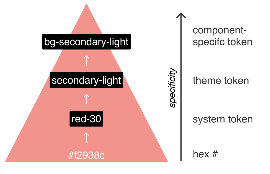
- USWDS includes a default set of theme tokens that meeting a wide variety of design needs.
- Aim to specify your color palette using these tokens names, swapping out the hues and tints/shades as needed for your project.
- When possible, use alternative colors from the USWDS system token palettes.
- There are benefits like saving time browsing palettes, maintaining cohesion across a variety of government projects, and leveraging built-in color contrast features (described more below in Keeping color accessible).
- Instead of spending time on picking grays, consider using the gray cool or gray warm families to change up the default
basetokens.
Pro tip
Use the USWDS Color Tool from Civic Actions to find system token colors similar to existing colors on a project that you may want to migrate.
Use this Figma template to define your theme token palette
Keeping color accessible
- USWDS has defined tints and shades for each color family using a consistent grade system, with each hue having 10 grades from 5 to 90.
- These grades enable you to confidently pair colors knowing you’ll get a particular level of compliance depending on what numbers you use.
- For example, pairing two colors from any family with a difference in grade of 40 or more will meet the minimum contrast requirements for WCAG 2.0 AA Large Text.
- Grade 50 will meet the requirements when paired with white or black.
- See the section on magic numbers for more details.