Logotype
There are two signature marks that define Bixal —the primary logotype and the complementary B. The primary logotype is cleancut and powerful.
Download the logotype Download the monogramHow the logo was created.
The primary logotype informs-and complements-the B mark, ensuring a scalable and dynamic visual expression throughout designs.
Guidelines
Using the logo
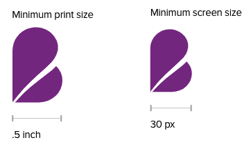
In order to maintain the visual integrity of our logo, always be sure to include space around it. A minimum equivalent to the height of the logo should also be observed around the logo, and ensure that the logo is always scaled proportionally. To make sure our mark remains legible at smaller sizes, the full mark should only be scaled down to .625” wide for print applications, with the preferred minimum web size at 40 pixels wide.
Maintaining the integrity of our mark
To ensure brand consistency, it is important that the logo be used appropriately. Below are examples of correct usage of the logo, as well as examples of treatments to avoid with the logo.
The logo will most often be black or white, but may be set in one of the brand colors if the design allows. Be sure the color is always legible, whether applied to a color or image background.
What not to do with the logo
The B
B is for Bixal. This core complementary brand element is a highly flexible mark designed to serve all types of design applications. The placement, size and color of the B can be modified to suit the design. When considering whether to implement the B as a shape or as an image mask, assess the content itself:
- The image mask treatment may be more suitable if the content is more formal—this style allows for more seamless text overlay.
- The shape treatment may be more suitable for applications where the image selection plays a critical role in reinforcing the content or telling a story.
Using the B
The B may be used either as a shape or as a photo mask. This flexibility reinforces its strength as a core brand element and adds visual interest to image selection.
Color B and background image
To use the B as a shape, use the color pairing guidelines to choose a color that contrasts with the logotype and headline color.
- The B, text box, and focal point of the image should not overlap. Create movement in the design by drawing the eye around the page between these three core elements.
- The photo should bleed to the edge of the design area. The B should take up no more than half of the design area when implemented as a solid shape. If overlapping text is applied, be mindful of color selection and font size to ensure legibility.
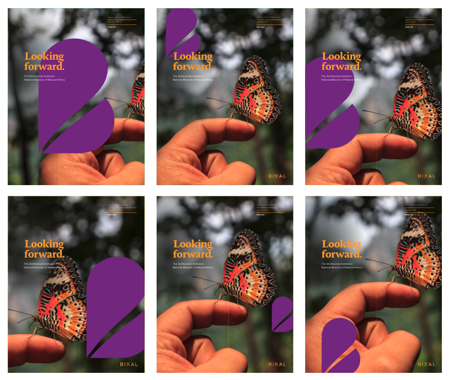
Image masked in B and color background
To use the B as a photo mask, crop the image such that the focal elements of the image are clearly revealed by the B mark.

What not to do with the B
